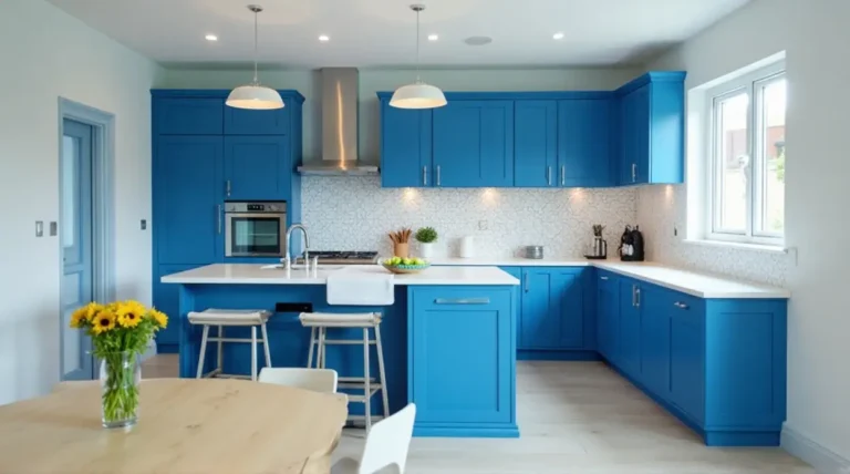
Have you ever walked into a kitchen and felt like you could just… breathe? That’s the power of blue. For years, we’ve been trapped in a world of “greige” and “all-white-everything.” But things are changing. People are getting bolder, and blue has stepped up as the MVP of the renovation world. It’s versatile, it’s timeless, and honestly, it’s just plain cool.
In this guide, we aren’t just looking at a few swatches. We are uncovering 27 jaw-dropping ways to use blue in your kitchen, from the cabinets to the walls and everything in between. Whether you’re a fan of a deep, stormy ocean or a clear summer sky, there’s a blue out there calling your name.
Why Blue is the New Neutral in Modern Kitchen Trends
Why is everyone suddenly obsessed with blue? It’s because blue acts like a “secret neutral.” Much like a pair of dark denim jeans, navy or slate blue goes with almost anything. It provides a grounding presence that white simply can’t match, yet it doesn’t feel as heavy or “gothic” as pure black.
In terms of psychology, blue is associated with calmness and reliability. In a room as chaotic as a kitchen—where timers are going off and kids are doing homework—having a color that lowers the heart rate is a total win. Plus, it hides fingerprints a lot better than white. Can I get an “amen” from the parents out there?
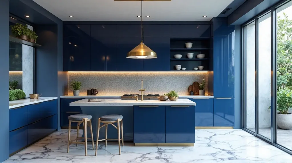
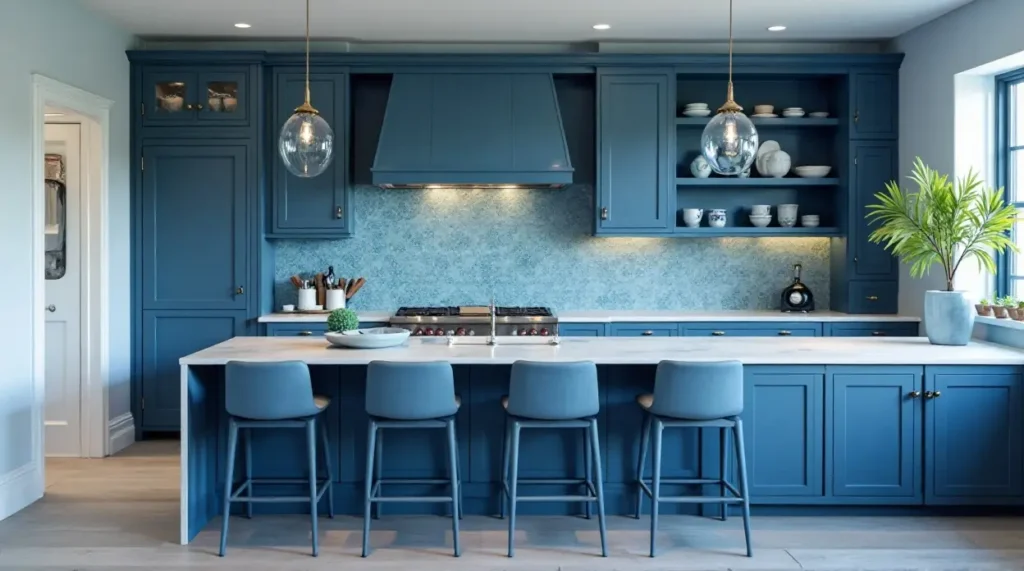
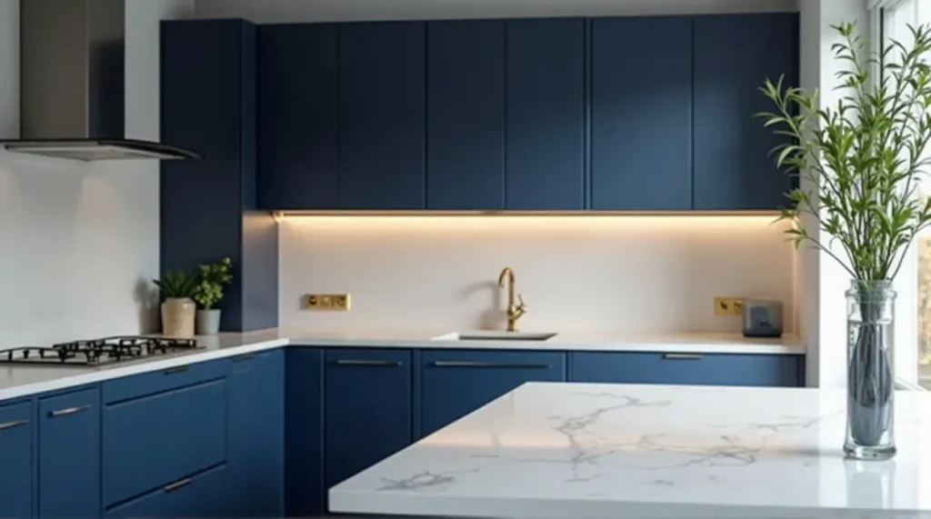
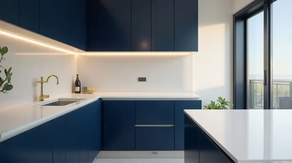
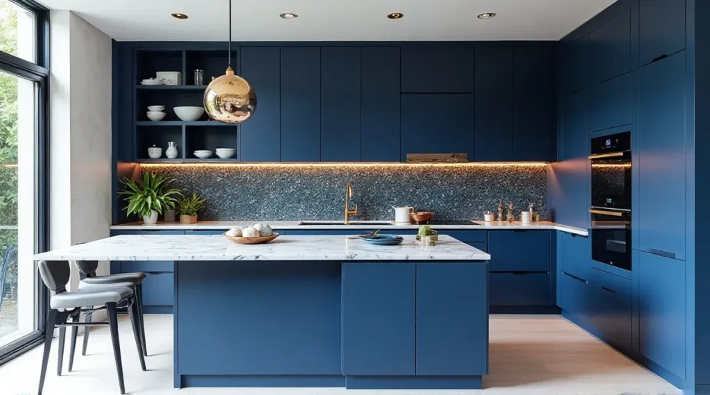
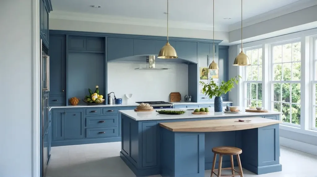
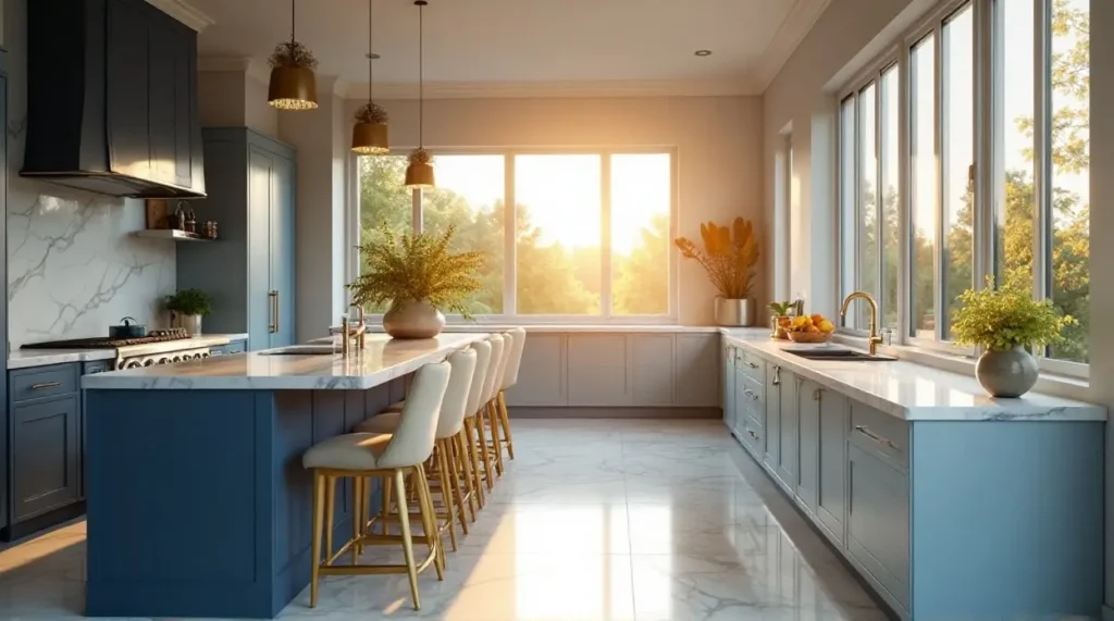
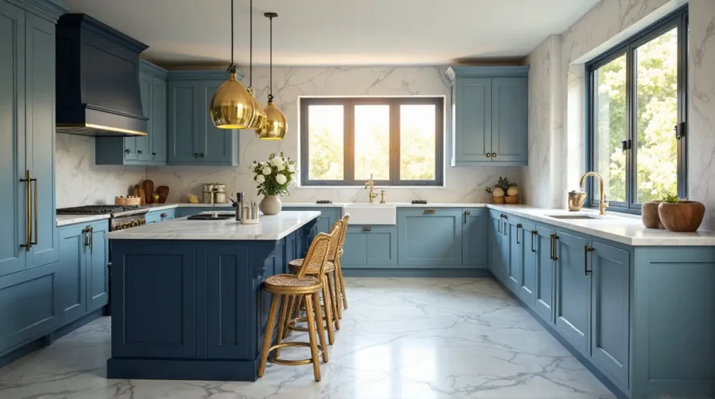
1. The Royal Treatment: Navy Blue Cabinets with Gold Accents
There is something undeniably regal about navy blue. It’s the “tuxedo” of kitchen design. When you pair a deep, saturated navy cabinet with shimmering gold or brass hardware, you aren’t just making a kitchen; you’re making a statement.
Choosing the Right Shade of Navy for High Contrast
Not all navies are created equal. Some have a heavy black undertone, while others lean toward purple. For a high-contrast look that pops against white marble, look for a “True Navy.” Think of the color of a classic pea coat. This shade provides enough depth to feel expensive but enough color to stay vibrant under bright kitchen lights.
Matching Hardware: Brushed Brass vs. Polished Gold
If you want a modern, slightly industrial feel, Brushed Brass is your best friend. It has a matte quality that feels sophisticated. However, if you want that “wow” factor, Polished Gold reflects light beautifully against dark blue surfaces. It’s like putting jewelry on your cabinetry.
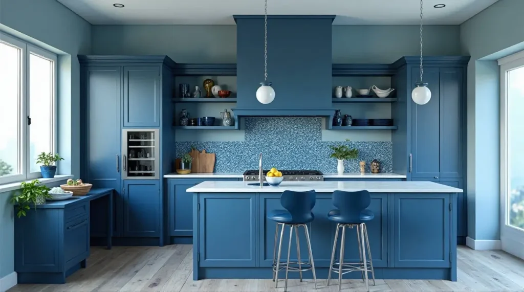
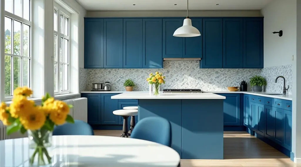
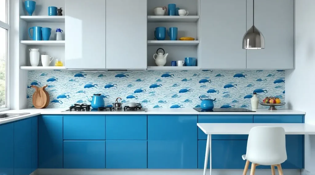
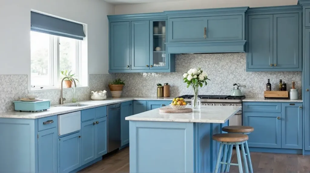
2. Coastal Calm: Sky Blue and Pastel Palettes
Maybe you don’t want a tuxedo. Maybe you want a beach house. Sky blue and soft pastels are the ultimate way to bring that “vacation vibe” into your daily routine. These shades work exceptionally well in smaller kitchens because they reflect light rather than absorbing it.
Pairing Light Blue with White Quartz Countertops
To keep a light blue kitchen from looking like a nursery, you need a crisp “clean-up” color. White quartz with subtle grey veining is the perfect partner. It mimics the look of clouds against a blue sky. Throw in some open shelving made of light oak, and you have a space that feels airy, organic, and effortlessly chic.
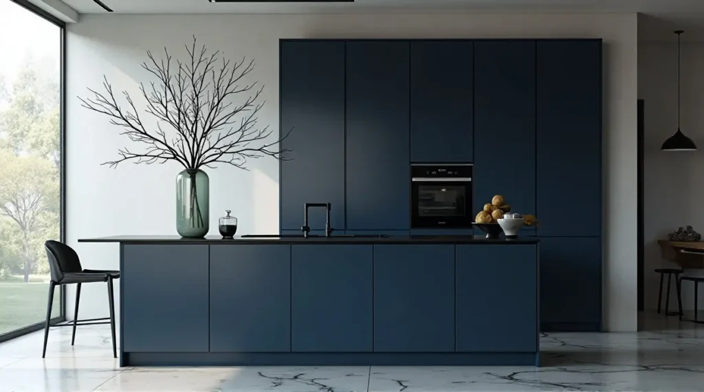
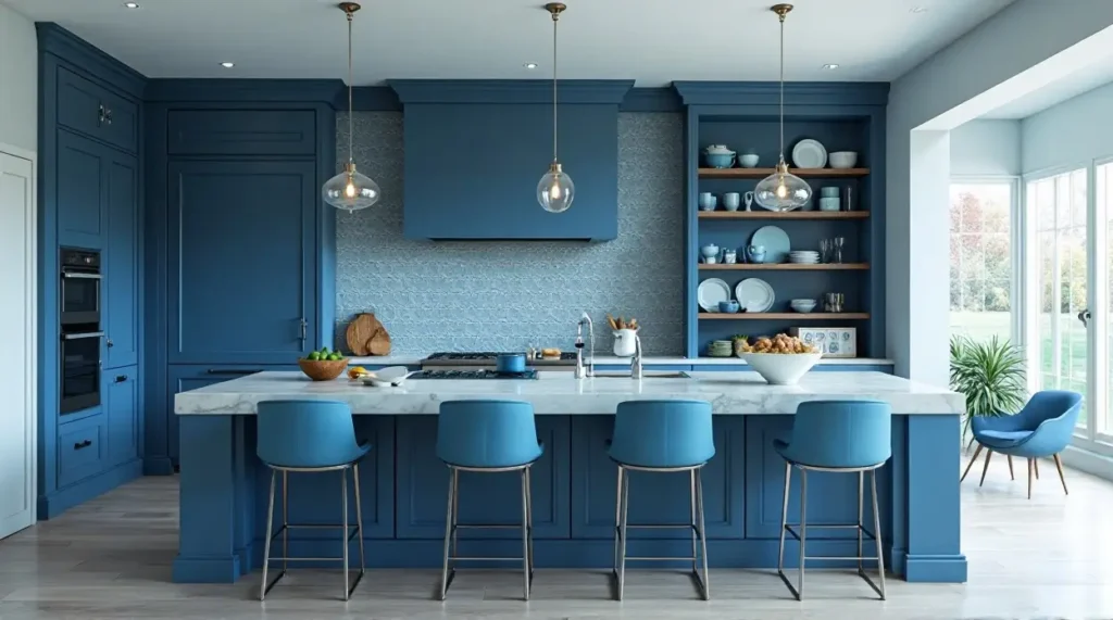
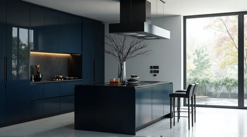
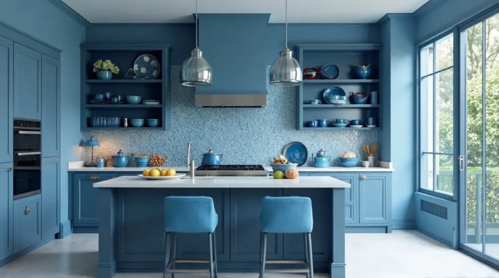
3. The Moody Masterpiece: Charcoal-Blue and Indigo
For the bold souls who want a kitchen that feels like a cozy jazz club, indigo and charcoal-blue are the way to go. These are “moody” colors. They work best in kitchens with plenty of natural light or a very intentional lighting plan.
Integrating Matte Finishes for a Sophisticated Look
When working with very dark blues, stay away from high-gloss finishes unless you want a very specific retro look. A matte or “suede” finish absorbs light in a way that makes the color look richer and more “velvety.” It adds a layer of tactile luxury that you can almost feel with your eyes.
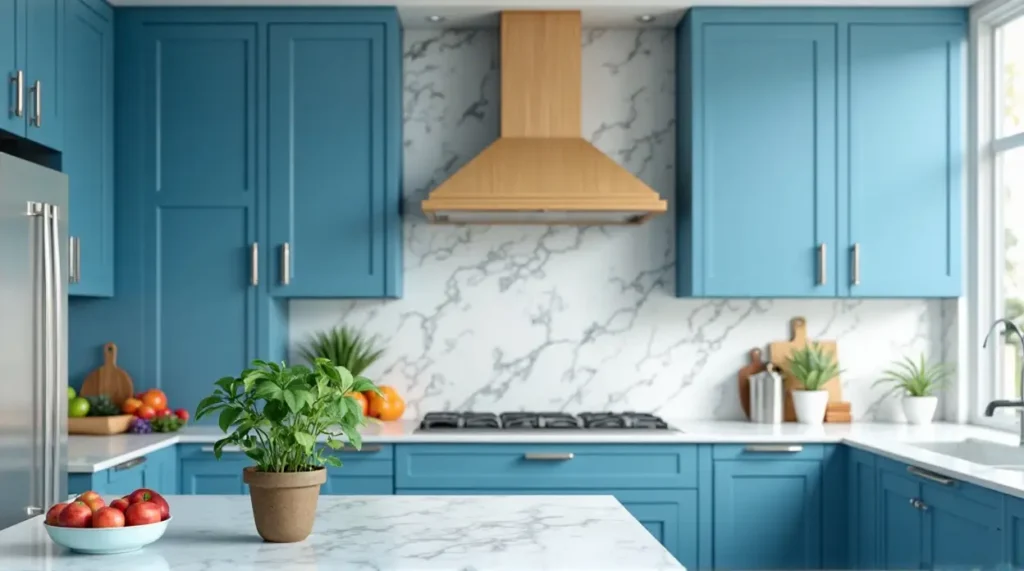
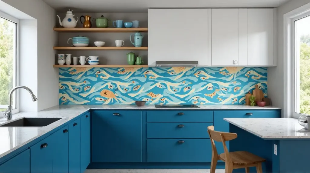
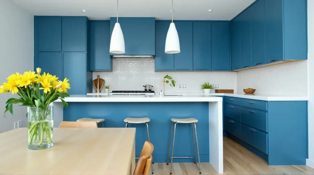
4. The Teal Appeal: Where Green Meets Blue
Teal is the wild card of the blue family. It’s energetic, quirky, and incredibly trendy right now. Because it sits right on the edge of green, it feels very “alive.”
Teal Cabinets with Natural Wood Accents
Teal can be loud, so you have to ground it. Natural wood—like walnut or reclaimed timber—is the perfect stabilizer. The warmth of the wood balances the “coolness” of the teal. Imagine teal base cabinets paired with thick butcher-block countertops. It’s a match made in design heaven.
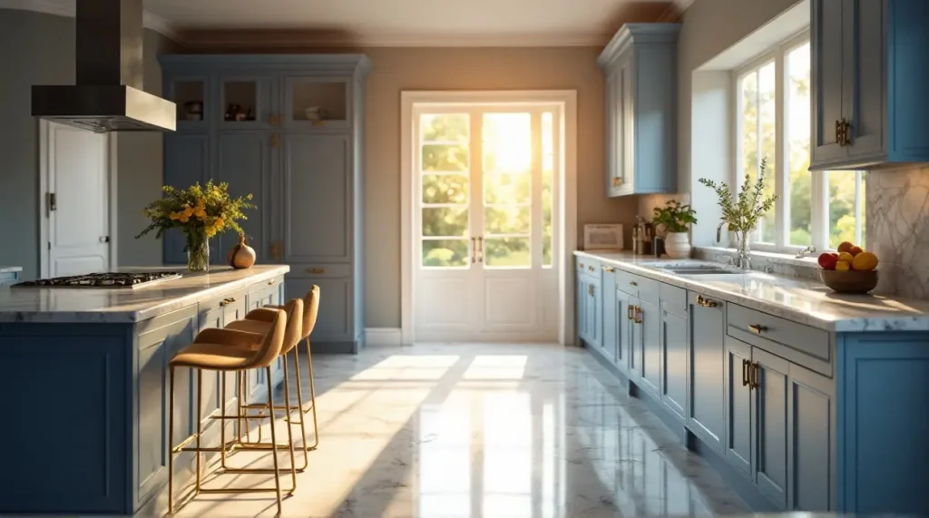
5. Two-Toned Magic: Blue Islands and White Surrounds
Are you “blue-curious” but not ready to commit to a full set of colored cabinets? The two-toned approach is your safety net.
How to Balance Dark Lower Cabinets with Light Uppers
The most popular way to do this is the “weighted” look: dark blue lower cabinets and crisp white upper cabinets. This keeps the room feeling tall and spacious. Alternatively, keep all your perimeter cabinets white and make your kitchen island a bold, deep blue. It turns the island into a piece of “furniture” rather than just another counter. It’s the ultimate focal point.
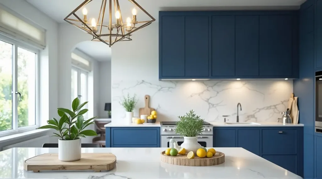
6. Mediterranean Dreams: Cobalt and Azure Backsplashes
Sometimes, the cabinets should stay neutral, and the “blue” should come from the tile. A cobalt blue subway tile or an azure mosaic backsplash can transport your kitchen to the shores of Greece or Italy. It’s a high-impact way to introduce color without the long-term commitment of painted wood.
7. The Dustier Side: Sage-Blue and French Blue
If “bright and bold” isn’t your speed, let’s talk about “dusty” blues. These shades have a grey or silver undertone that makes them feel vintage and lived-in.
Vintage Charm: Distressed Finishes and Farmhouse Sinks
French blue looks incredible when paired with a white apron-front farmhouse sink and bridge faucets in rubbed bronze. It feels like a kitchen that has seen generations of Sunday dinners. It’s nostalgic, comforting, and incredibly classy.
Selecting the Perfect Paint: Top Brand Recommendations
If you’re DIY-ing your cabinet makeover, the paint choice is everything. You want a “self-leveling” paint that dries hard.
-
Hale Navy by Benjamin Moore: The gold standard for navy kitchens.
-
Stiffkey Blue by Farrow & Ball: An inky, moody blue that changes with the light.
-
Naval by Sherwin-Williams: A deep, classic blue that feels timeless.
-
Pigeon by Farrow & Ball: For those who want that “blue-grey-green” dusty look.
Lighting Your Blue Kitchen: Avoiding the “Cold” Trap
One warning: blue is a “cool” color. If you use “daylight” or “cool white” LED bulbs (5000K+), your kitchen can end up looking like a sterile laboratory. To keep the space inviting, use Warm White bulbs (around 2700K to 3000K). The warmth of the light will play off the blue, making it feel cozy and expensive rather than cold and flat.
Conclusion: Making the Leap into a Blue Kitchen
A kitchen renovation is a big deal, and picking a color like blue can feel like a risk. But isn’t life too short for a boring kitchen? Whether you choose a navy that feels like a midnight sky or a teal that reminds you of the ocean, you’re infusing your home with personality. Blue is reliable, it’s beautiful, and it’s a design choice you won’t regret when you’re sipping your morning coffee in a space that feels uniquely you.
Frequently Asked Questions (FAQs)
1. Will blue cabinets make my kitchen look smaller? Dark blues can make a space feel more enclosed, but if you balance them with white countertops, light floors, and good lighting, they actually add depth, which can make a room feel more “grand” rather than smaller.
2. What floor colors go best with blue cabinets? Light oak or honey-toned wood floors are the most popular because the warmth of the wood perfectly balances the coolness of the blue. Light grey tiles or classic white marble also work beautifully.
3. Is blue a “fad” that will go out of style? While specific shades (like bright teal) might trend in and out, Navy and Slate blue have been used in design for centuries. They are considered “classic” colors that hold their value well for resale.
4. Can I use blue in a small galley kitchen? Yes! Try using a light, “ice blue” or a “soft dusty blue.” These shades reflect light and can make a narrow galley kitchen feel wider and airier.
5. How do I choose between matte and glossy blue cabinets? Matte is generally more modern and sophisticated, and it hides smudges better. Glossy finishes are great for “retro” or “ultra-modern” high-gloss designs, but they require a lot more cleaning to keep them looking sharp.